Packaging stimulates the initial trial of a brand and then, after a satisfying first experience, helps consumers find it among the thousands of other brands on the shelves to buy again…and again…and again. How you evolve your packaging could be about shapes, materials, and even brand names and logos, but they are not the most important brand identity drivers. People don’t go into the store and read brand names; they search for the unique look of their preferred brand.
As marketers, we use color as a beacon to light the way to our brand. That makes sense. But we need to make sure we choose packaging and logo colors to reflect how we want consumers to perceive our brand. In the early days of Coca-Cola, red was a relatively fresh color to put on packaging at the time. Later, it made sense for Pepsi-Cola to go with something different, blue, but still reflecting the bright and refreshing appeal of a new cola beverage category.
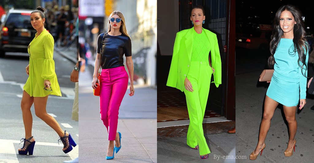
A lot has changed over the last 125 years, yet most brands have stuck with their original look and color scheme. Fashion has certainly evolved over that time, but except for a few years in the 1920s, and then in the late 60s, fashion colors have remained pretty basic with subtle shades of brown, blue, red, black, and white. In the 1990s all that blew up with the neon craze; it was so bright you felt like you needed to wear sunglasses on a cloudy day.
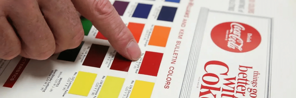
Automobile colors didn’t go this far and neither did most brand color schemes. Coke stayed with the same Pantone 484 red through all of that, too.
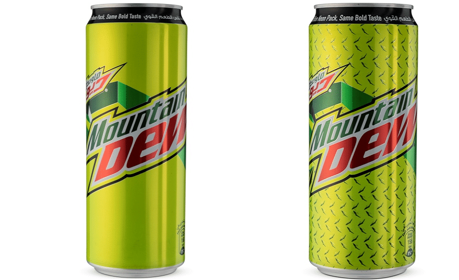
The Pepsi-Cola Company went the full neon route with their teen brand Mtn Dew. The beverage was narrowly focused on teenagers, which gave it the relevant permission to shift quickly to stay in touch with new trends. But Coke and Pepsi, with much broader consumer age ranges, stayed pretty much the same with their basic red and blue.
Out of that sharp change to neon in the 90s, fashion came back around in the 2000s, but not to the flat colors of the 80s. Flat colors were viewed as nostalgic, old, and out of touch with today, something brand a 100 year old brand like Coke did not want to become, especially as Pepsi was using the slogan The Choice of a New Generation in a positioning attempt to make Coke seem old and irrelevant.
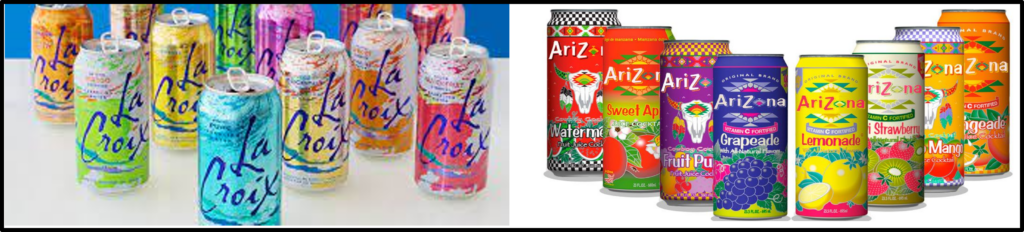
While at Coca-Cola, I remember how I wanted our brand to be more dynamic with our packaging, like some of the new beverages coming on to the market at the time such as La Croix water and Arizona iced tea.
But that wasn’t Coke. And it still isn’t. A core brand pillar of the Coca-Cola brand is continuity. We learned this the hard way when we slightly changed the recipe in 1986 with New Coke. This started a consumer rebellion against the company and its leadership.
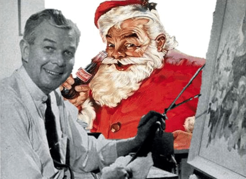
The Coca-Cola Company loves red. There was a joke inside the company: If it moved, Coke sponsored it. And if it stayed still, Coke would paint it red. Here’s a piece of brand history for you: Coke commissioned an artist named Haddon Sundblom in 1931 to illustrate the modern jovial Santa consumers recognize today, associating it with the beverage that has been a mainstay in their lives all these years.
Out of the brilliantly bright, yet temporary swing to neon, what emerged is more vibrant than the flat Pantones of before. The consumer changed. If you’re a parent today and you want to show your kids one of your favorite movies, they will likely reject it, or at least comment that it is old and out of date. The slower pacing, static camera shots, and softer cuts in editing have been replaced in their world with rapid fire camera shots, sharp cuts and the Twitter-style pacing that frames their perception of what is…and what is not…contemporary and relevant to today. It’s the same with color.
To stay relevant, Coke red evolved to a richer and more intense shade of red that it now uses on its packaging. Not a dramatic change that would disrupt the continuity of the brand but updated to stay relevant to a changing consumer.
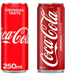
If you saw someone in the street wearing a sweater in the flat red of the Coke can on the left, you might not be able to immediately say exactly why they look unfashionable; a sweater in the red on the right is much trendier and is simply perceived as cooler and more relevant. The evolution from flat colors of the 80s to the highly vibrant neon of the 90s and 2000s has evolved to a more intense color preference that brands need to reflect to stay relevant. It’s also important that well-known brands stay within the recognizable color cue for their brand, as Coke has.
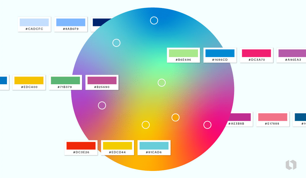
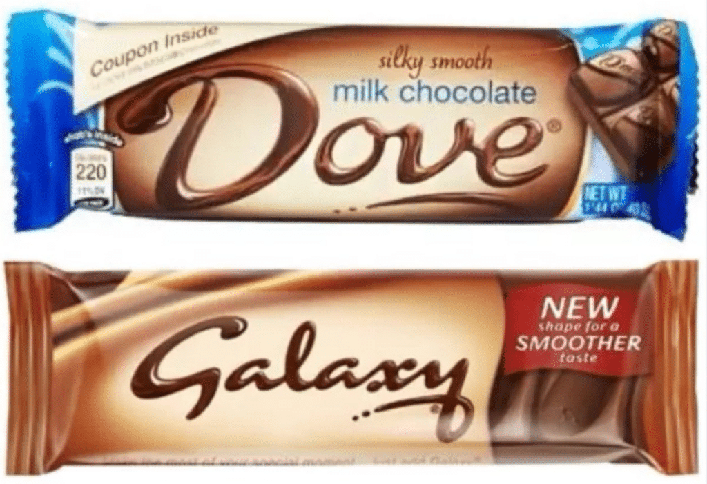
If your brand color cue is green, you can move within that color area of the color wheel and likewise with red, blue, or yellow. We have also seen this in the confectionery aisle with what Mars has done with its Galaxy brand and its rich transition of colors that express both elegance and relevance to their target of young women consumers.
Probably the most iconic comfort food brand in the USA is Kraft’s Mac and Cheese. Kraft has adapted the packaging not only to a more intense blue, what some are describing as a more ‘electric’ color tone, but also the yellow.
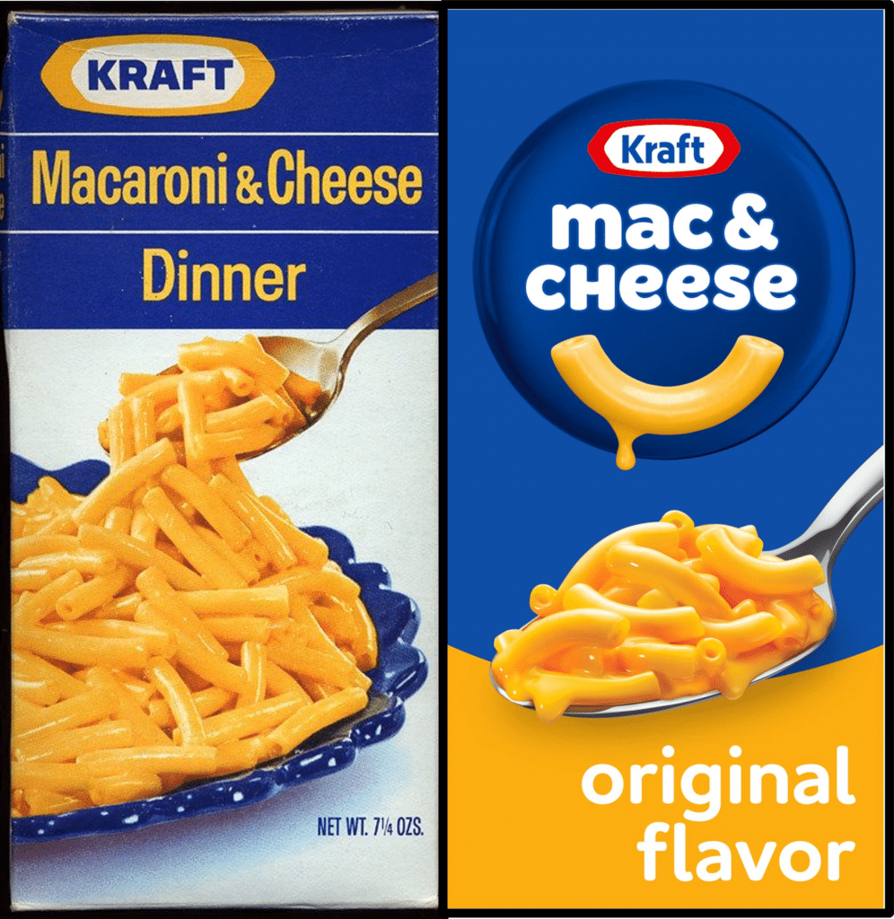
The Kraft brand manager would be quick to point out that they also changed the logo to increase the taste appeal of creamy cheese. As marketers, we make additions and changes like that all the time on our packaging to communicate brand benefits. But first, we need to think carefully about how we use colors. The difference between iconic and nostalgic is relevance. Selecting the right colors and evolving the tone of the brand colors to stay in tune with the rapidly evolving perceptions and attitudes of your consumers is how you stay relevant.